Small apartments often feel cramped, but the right paint color changes everything. Designers use specific shades to trick the eye and maximize limited space.
Strategic colors reflect light beautifully, making tight walls push outward visually. Instead of sticking strictly to basic white, experts embrace soft neutrals, muted earth tones, and even deep, moody hues.
These clever selections inject personality without overwhelming your floor plan. Ready to transform your compact home into an airy sanctuary? Let us explore the exact paint colors top interior professionals trust to make small rooms feel incredibly grand.
Living Room Layering Tricks
Tiny rooms require a strategic approach to color application to maximize their visual footprint. Painting the baseboards and trim the exact same color as the walls creates an unbroken vertical line. This clever design trick makes short ceilings feel much higher than they actually are.
Selecting the right finish matters just as much as picking the pigment itself. Eggshell or satin finishes reflect soft light across the room without creating a harsh, distracting glare. Matte finishes work best on uneven walls because they hide minor drywall imperfections beautifully.
- Lighting: Warm, filtered sunlight shifts how gray and beige undertones appear throughout the day.
- Color Anchor: Select one dominant wall color to ground the room before buying accent decor.
- Renter Tip: Peel-and-stick paint samples let you test colors without marking up white walls.
- Texture: Pair flat wall paint with plush textiles to give the space physical depth.
1. Blush Pink Bedroom Walls with Brass Sconces
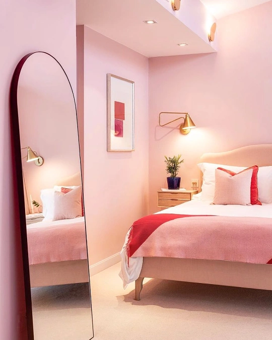
Soft pink paint wraps this compact bedroom in a warm, welcoming glow that feels cozy rather than childlike. A large arched floor mirror bounces the golden light from a brass swing-arm lamp across the plush cream carpet. Rich cherry red accents on the bedding pillows and framed artwork break up the pastel palette with sharp, intentional contrast.
Monochromatic wall framing tricks the eye into seeing more vertical space by blurring sharp room corners.
Enveloping an entire small bedroom in a single soft hue eliminates harsh visual boundaries that clip a room short. Brass hardware and warm lighting fixtures enhance the underlying yellow tones of a blush paint formula. This combination stops the light pink from feeling cold, sterile, or overly sweet in dim evening conditions.
2. Ochre Yellow Hallway with White Trim and Globe Pendant
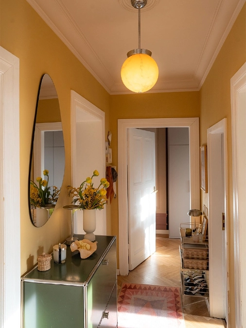
Rich mustard ochre paint breathes vibrant warmth into this narrow apartment entryway, pairing beautifully with the crisp white door frames. An asymmetrical organic mirror hangs above a dark green metal credenza, catching the golden glow of a spherical ceiling light.
A patterned runner rug grounds the classic herringbone wood floors while yellow tulips echo the saturated wall color.
Deep, sun-drenched tones fill windowless thoroughfares with an inviting presence that neutrals cannot match.
Dark or narrow hallways often fail to receive enough natural sunlight to make plain white paint look clean. Leaning into a saturated, mid-tone color like ochre creates a deliberate, cozy destination out of a pass-through zone. Painting the ceiling a clean white helps bounce illumination downward from the pendant fixture to keep the hallway open.
3. Peach Dining Room with Sage Green Pocket Doors
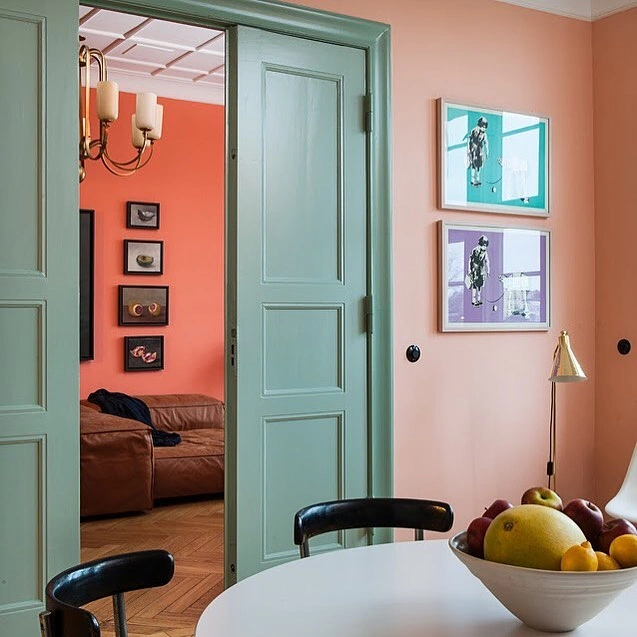
Soft pastel peach walls establish a cheery foundation for this dining area, flowing seamlessly toward a vibrant terracotta living room visible beyond the doorway. Large paneled pocket doors coated in a muted sage green paint introduce a cool counterpoint to the surrounding warm pigments.
Modern graphic prints in teal and purple frames break up the solid wall expanse above a white dining table.
Contrasting pastel walls against a muted trim color creates unexpected architectural depth in connected rooms.
Using a cool tone like sage green on interior doors draws the eye forward, acting as a clever visual frame for the adjoining space. This layering technique makes distinct apartment zones feel interconnected yet separate without using bulky physical dividers. The progression from soft peach to a punchier terracotta adds immediate interest as you move through the home.
Why This Works
- Color Anchor: The gentle peach backdrop stabilizes the bold accents without making the small dining area feel dark.
- Statement Piece: Sage green pocket doors break up the sweet pink undertones with a sophisticated, earthy touch.
- Layering: Stacking warm wall colors in sequence through the open doorway creates a comforting sense of endless perspective.
4. Cream Studio Kitchen with Red Accent Stripe and Blue Lower Cabinets
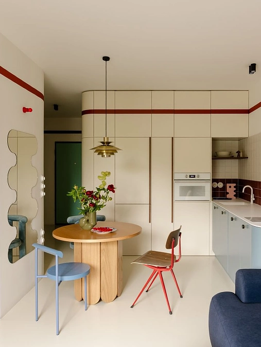
Smooth cream paint wraps the upper cabinetry and main walls of this efficient open-concept studio layout. A thin, horizontal crimson red stripe cuts across the storage units, drawing a bold geometric line around the dining area. Sky blue lower kitchen cabinets introduce a playful pop of cool color beneath a crisp white countertop.
Running a thin, high-contrast stripe across plain cabinetry instantly stretches a room horizontally.
Choosing an ultra-creamy white tint for small spaces provides warmth without feeling cold or clinical. Incorporating a thin accent band near the upper third of the wall tricks the eye into scanning the perimeter of the layout. This simple paint technique gives a compact kitchen setup a custom, architectural feel without the cost of heavy structural renovations.
5. Pale Gray-Green Living Area with Arched Pass-Through
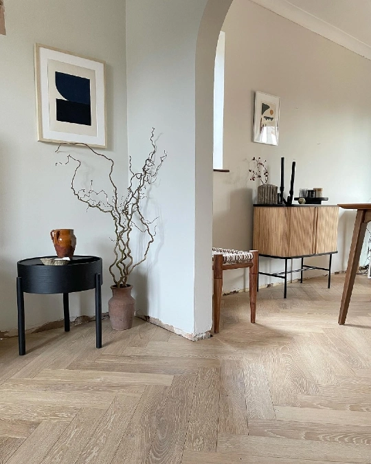
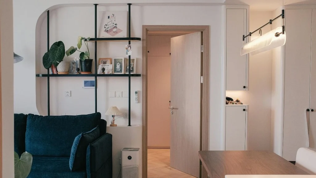
An airy, pale gray-green paint coats the foreground wall, establishing a serene entrance near a black cylindrical side table. Looking through the open plaster archway reveals an adjoining dining space painted in a warm, stone-beige hue. Light oak herringbone flooring flows between both rooms, tying the cool and warm paint tones together seamlessly.
Shifting paint undertones between adjoining rooms makes an open apartment layout feel instantly larger.
Painting a connecting archway or structural wall a slightly different shade defines separate living zones without blocking sightlines. The subtle contrast between the cool green-gray foreground and the warm beige background coaxes the eye to look deeper into the apartment. This transition mimics the natural interplay of light and shadow, creating an illusion of expansive square footage.
Quick Styling Tips
- Budget version: Buy a single quart of a coordinating shade to paint just the inside curve of an archway for a subtle, dimensional zone marker.
- Renter tip: Stick to light neutral walls but use large-scale peel-and-stick art prints to introduce contrasting cool or warm tones to different zones.
- Pro move: Coordinate your wood furniture undertones with the flooring to ground the space, allowing the shifting wall colors to take center stage.
6. Muted Sage Bedroom Accent Wall with Woven Sconce
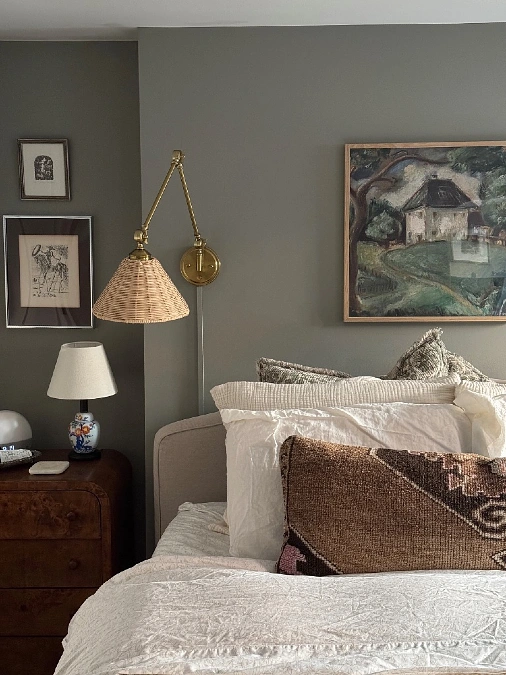
Deep sage gray-green paint forms a serene, moody backdrop for this comfortable sleeping alcove. A brass swing-arm sconce with a woven rattan shade casts down-lit warmth against the matte wall color, highlighting a framed oil painting of a landscape. Plush linen layers in shades of cream, olive, and chocolate brown pile high on the bed next to a rich burl wood nightstand.
Embracing dark, desaturated wall tones in a compact bedroom creates an intimate cocoon effect that encourages rest.
Small bedrooms often excel when you ditch the rulebook and lean directly into darker, nature-inspired pigments instead of stark white. A muddy green-gray acts as a rich neutral that recedes from view, making the physical boundaries of the bed alcove feel less restrictive.
Pairing this deep paint choice with tactile elements like brass, woven fibers, and heavily textured textiles adds essential layers of physical warmth.
7. Soft Off-White Living Room with Slate Blue Ceiling
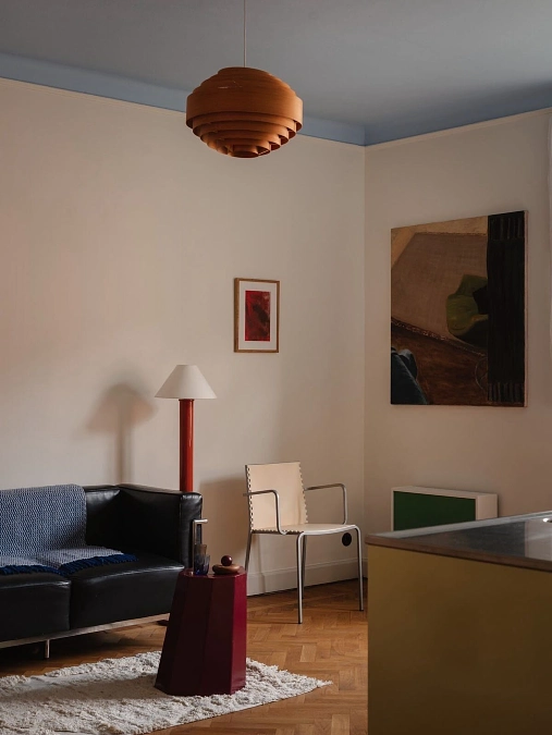
Crisp off-white paint sets a calm, understated tone on the main walls of this modern apartment living area. High overhead, a soft slate blue paint coats the ceiling, dropping down slightly to meet a thin white boundary trim line. A black leather sofa, a terracotta-red floor lamp, and a tiered wooden pendant light introduce sharp graphic shapes against the quiet background.
Coating a low ceiling in a cool, atmospheric color makes the overhead surface appear to recede like an open sky.
Limiting color to the ceiling draws the eye upward and shifts the focus away from a tight floor plan layout. The cool undertones of slate blue work remarkably well here because they mimic natural shadow and open air. This specific placement allows you to keep the main walls a clean, reflective off-white while still indulging in a unique design statement.
8. Mauve Living Zone with Wavy White Mirror and Blue Petal Pendant
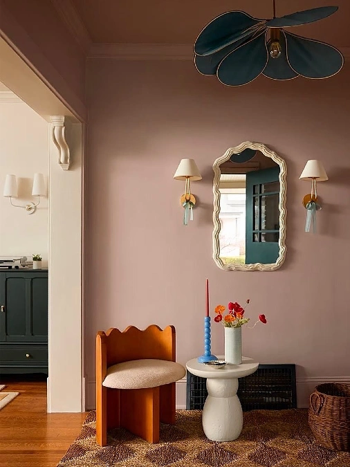
An earthy, desaturated mauve paint wraps the main walls and upper trim of this eclectic seating nook. A wavy cream-framed mirror sits dead center between two brass wall sconces decorated with tiny blue ribbons.
Below, a sculptural wooden chair and a round concrete accent table rest on a chunky woven fibers rug, while a dark teal floral pendant hangs overhead.
Wrapping a low-light entryway in a complex, muddy pastel color adds immediate character that stark whites cannot mimic.
Saturated shades containing a balance of gray and brown undertones react beautifully to warm, filtered indoor lighting. Mauve functions as a versatile, moody backdrop that allows playful sculptural furniture and striking cool accents to pop with clarity.
Bringing the exact same paint color up across the crown molding creates an unbroken flow that elongates the vertical plane.
9. Lilac Checkerboard Accent Stripe in a Bright Bedroom
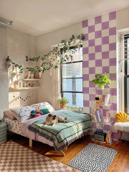
A playful lavender purple and off-white checkerboard pattern climbs vertically up the wall, creating a distinct graphic column next to a sunny window. The neighboring walls feature a crisp, reflective white paint finish that bounces intense natural sunlight across a low-profile wooden bed.
Artificial green vines with hanging pink blossoms drape over the headboard zone, matching the whimsy of a small pug resting on a sage-green blanket.
A vertical geometric accent stripe acts as an anchor that zones a small layout without overwhelming the main footprint.
Confining a bright pastel hue like lilac to a structured, narrow pattern prevents the pigment from over-saturating a tiny room. The white squares within the checkerboard design match the surrounding flat wall paint, keeping the playful graphic element feeling integrated.
This clever framing trick creates an eye-catching backdrop for a clear acrylic storage tower and vibrant indoor potted plants.
Why This Works
- Focal Point: The purple checked stripe draws immediate attention upward, making the apartment ceiling feel tall and breezy.
- Statement Piece: Combining a bold graphic paint detail with organic trailing vines breaks up flat drywall with rich visual texture.
- Color Anchor: Keeping the largest wall surfaces a crisp off-white balances the colorful bedding elements and patterned accent rugs below.
10. Lilac Checkerboard Arch and Bubblegum Pink Corner Accent
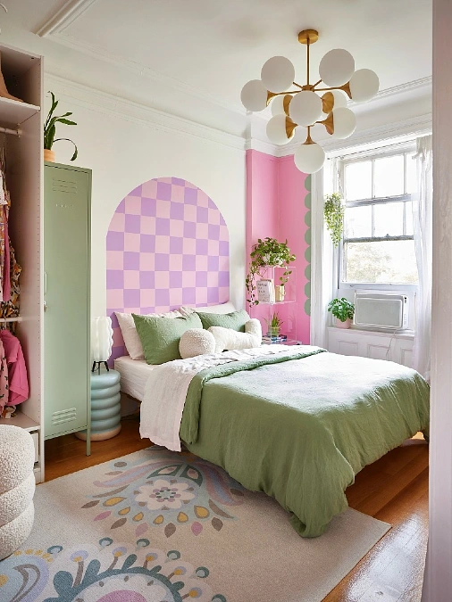
A crisp white backdrop sets a bright tone for this eclectic bedroom layout, highlighting a painted lilac and soft pink checkerboard arch directly behind the bed pillows.
A vibrant bubblegum pink paint spans the far corner wall, finished with a playful scalloped green border next to a sunlit window casing. Olive green bedding, a tall mint-green metal storage locker, and a multi-globe brass chandelier ground the whimsical accent colors.
Painting a faux graphic arch behind a low bed frame mimics the structural presence of a headboard without using valuable physical inches.
Using crisp white walls as a primary base allows you to experiment with high-contrast pastel shapes in specific zones. The bubblegum pink corner paint creates a distinct visual nook for plant shelving without shrinking the wider sleeping area.
This clever combination of graphic elements gives a rental apartment bedroom a custom, cheerful energy that completely bypasses plain drywall.
11. Coral Pink Living Room with Floral Fireplace Wallpaper Accent
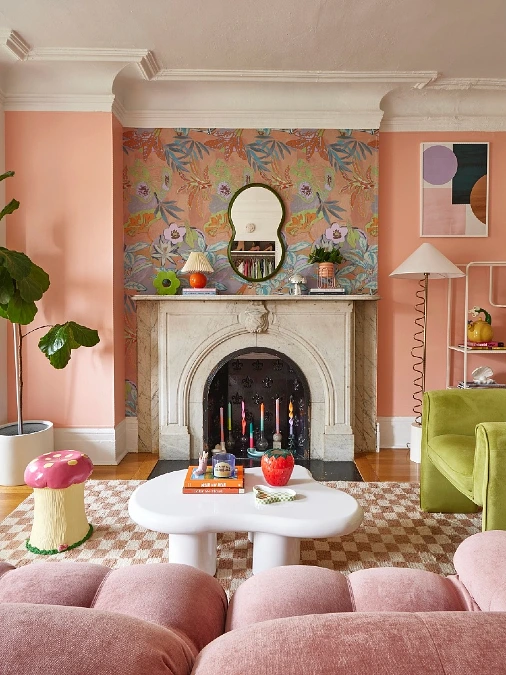
A cheery coral pink paint wraps the projecting wall columns and high baseboards of this expressive apartment living hub. An intricate botanical wallpaper pattern filled with lime, orange, and purple hues covers the recessed alcove behind a vintage white marble fireplace.
A plush, tufted blush couch sits in the foreground facing a wavy white coffee table and a playful ceramic mushroom stool.
Choosing a warm, sun-drenched coral tint makes a compact living room feel constantly bathed in golden-hour light.
Saturating the structural columns in a single, sweet tone while adding busy wallpaper to the recess gives a flat wall immense architectural depth.
The coral pink acts as a stabilizing color frame that pulls the varied hues of the floral pattern together with ease. Thick white crown molding breaks up the bright wall color, pulling the eye upward toward the high ceiling.
Quick Styling Tips
- Budget version: Skip expensive wallpaper rolls and use leftovers from a tester paint jar to brush a solid, complementary olive green inside the fireplace alcove.
- Renter tip: Use a punchy coral shade on a piece of vintage wooden furniture or a large canvas frame if painting the actual drywall is restricted by your lease agreement.
- Pro move: Bring your wall color all the way down onto the fireplace surround or matching wall shelves to simplify the room silhouettes.
12. Sandy Beige Nursery with Mustard-Ochre Painted Ceiling
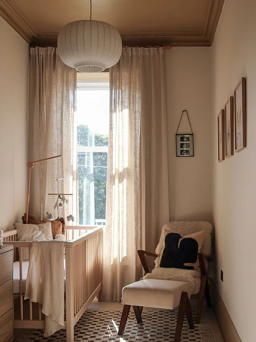
A calming, sandy beige paint coats the narrow walls of this compact nursery space, maximizing the soft light coming from the central window. Overhead, a rich mustard-ochre paint washes the ceiling and crown molding, wrapping the room in an unexpected layer of earthiness.
A light wood crib, breezy linen drapes, and a mid-century rocking chair with a plush sheepskin throw complete the tranquil setup.
Bringing a warm, deep tone onto a nursery ceiling shifts the focus from tight walls to a cozy, sheltering overhead canopy.
Using a quiet cream or beige on the primary walls prevents a narrow room from feeling like a hallway. Splurging on a rich color statement for the ceiling creates a beautiful view for an infant looking upward from the crib. This smart placement also coordinates gracefully with natural wood tones, woven textiles, and warm linen accents scattered around the floor area.
13. Deep Navy Bedroom Feature Wall with Pale Sage Trim
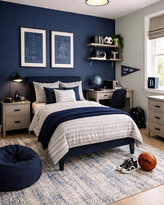
A heavily saturated navy blue paint blankets the primary feature wall, grounding the upholstered headboard and a pair of framed technical blueprint prints.
The perpendicular window wall wears a pale, desaturated sage gray shade that reflects soft light onto the matching wooden desk and dresser units. Striped bedding in slate gray and a chunky knitted indigo throw repeat the classic corporate color theme across a textured mottled area rug.
Anchoring a bed against a single velvety navy wall forces the boundary to recede, creating an illusion of depth in tight quarters.
Small bedrooms often benefit from a stark division of color that helps define functional zones like sleeping and studying. The deep blue hue absorbs harsh light gracefully, acting as a rich, shadow-like backdrop that highlights two floating wooden shelves overhead. Transitioning to a pale sage tint around the window ensures the study desk stays bright and alert for daytime tasks.
Why This Works
- Color Anchor: The dark navy feature wall gives the room a heavy focal point, making the other light-colored walls feel airy.
- Focal Point: Symmetrical blueprint artwork directly above the pillows draws your eyes up, expanding the room vertically.
- Texture: Mixing a flat matte navy paint with crisp striped cotton and a chunky knit blanket adds essential layer depth.
14. Muted Lilac Kitchen Walls with Cream Shaker Cabinets
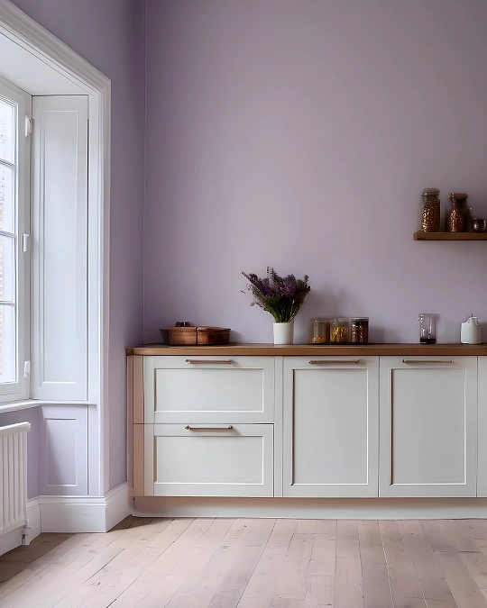
A soft, desaturated lilac paint introduces a tranquil, misty quality to the high walls of this minimalist kitchen setup. Classic off-white shaker lower cabinets anchor the space beneath a warm wood-toned countertop displaying glass storage jars and fresh purple lavender.
Crisp white architectural trim frames a deep paned window alcove, bouncing gentle daylight across the pale wooden floor planks.
Leaning into pale, gray-toned purples replaces cold kitchen whites with a soft mist that stretches small layouts.
Small kitchens can easily feel crowded when overwhelmed by busy patterns or heavy, dark storage units. Choosing a muted lavender with strong gray undertones creates an airy backdrop that visually pushes the walls back from the work counters. Pairing this cool tint with a warm wooden surface and cream shaker doors maintains a grounded balance that keeps the workspace cozy.
15. Charcoal Slat Wall Bedroom with Tan Leather Elements
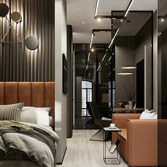
Deep charcoal gray paint runs along the high vertical slats behind an orange-tan channel-tufted headboard, adding intense structural depth to the bed area. An architectural glass divider separates the sleeping zone from a matching tan leather armchair and a narrow workspace in the background.
Linear LED ceiling strip lights and round black sconces bounce bright illumination across the light wood flooring and gray concrete-textured walls.
Saturating an accent wall in an ultra-dark charcoal gray strips away harsh shadows, making compact layouts feel deep and expensive.
Small spaces can handle moody, dark pigments when paired with plenty of integrated artificial lighting. The dark gray backdrop acts as a dramatic, receding canvas that forces the crisp lines of the modern furniture to snap into clear focus.
Using vertical wooden slats coated in the same dark hue adds a rich, physical texture that breaks up flat drywall panels beautifully.
Quick Styling Tips
- Budget version: Mount inexpensive MDF panels to standard drywall and coat them in a matte soot-black to get the look of high-end architectural slats for less.
- Renter tip: Install large-scale removable charcoal peel-and-stick wallpaper featuring an industrial concrete texture to add immediate depth behind a temporary bed setup.
- Pro move: Run thin LED strip lighting along the top or bottom edges of a dark feature wall to cast a striking, dramatic glow across the deep color tones.